About diagrams in GitHub Docs
Diagrams use shapes, lines, and labels to explain concepts visually. We use diagrams to support textual information in GitHub Docs.
Diagrams do not make information less complex, but they present a different way to receive and process information. Some people want to be shown information instead of reading it. Some people cannot engage with visual diagrams and need the information to be presented in text.
There are many uses for diagrams. Diagrams can provide high-level overviews of concepts that require paragraphs or entire articles to write about. Someone could view the diagram and then decide if they want to read more for additional information. Diagrams can also be used for system-level decision making by seeing an entire process at once or micro-level understanding of specific steps in a workflow. Diagrams are content, and like all content merit careful consideration of user needs to determine how to best use them.
Diagrams are creative. If you have an idea for a diagram that helps people, no matter the exact shapes that it uses, it might be a good fit for GitHub Docs. The following requirements and recommendations will help you create a diagram that can be included in GitHub Docs.
Diagram checklist
To be included in GitHub Docs, a diagram must meet the following criteria.
- The diagram can be accessed by as many users as possible.
- Diagrams have clear starting points and are easy to follow.
- Diagrams are preceded or followed by complete text descriptions in the article in which they appear, with no information conveyed entirely in visual form.
- Diagrams have appropriate contrast.
- Diagrams have appropriate alternate text.
- Diagrams are clear and crisp with elements as legible as possible.
- The diagram has acceptance criteria and meets them.
- Diagrams have an audience.
- Diagrams have the right amount of information and density.
- The diagram is visually sound.
- Diagrams follow the style set forth in this content model.
- Diagrams have enough information to be easy to understand and navigate, but they are not overly decorated or needlessly complex.
Maintaining diagrams
The creator of a diagram is responsible for maintaining it. If a diagram is out of date, it is the GitHub Docs team's discretion to remove, update, or replace the diagram.
When not to use diagrams
Diagrams are not a substitute for text. They compliment written information in articles. Do not add a diagram to try to simplify or fix an article that is confusing. Consider rewriting the article text and possibly adding a diagram if it supports the rewritten text.
When to use diagrams
Diagrams can be used in GitHub Docs when they help people and are not just visual adornment. To determine if a diagram is helpful, it needs acceptance criteria that include the following:
- Who is the audience for the diagram?
- What is the scope of the diagram?
- How does the diagram complements the accompanying text?
- How will you evaluate the diagram's effectiveness?
A diagram must always be accompanied by text that fully conveys the same information.
Acceptance criteria for diagrams
To create acceptance criteria for a diagram, answer these questions.
Who is the audience for the diagram?
Diagrams, like articles, can have broad or specific audiences. For example, diagram audiences could be people who are considering purchasing GitHub Advanced Security for their organization or students learning how the application process for GitHub Global Campus works.
What is the scope of the diagram?
The more information in a diagram, the more difficult it becomes to create and understand. All diagrams need an established scope to guide their creation and evaluate their effectiveness. For example, a diagram that explains what GitHub is has a very large scope. It would likely be confusing if it went into detailed information about every GitHub product and feature, so we would expect a diagram of this scope to provide a broad overview. In contrast, a diagram that helps someone evaluate whether GitHub-hosted runners or self-hosted runners are more appropriate for their uses will likely go into more specific and nuanced information since it has a more narrow scope.
How does the diagram complement the accompanying text?
A diagram can serve a different purpose depending on what text it is near. A diagram depicting a complex system following a text description of the system can offer a visual explanation of the system that will help some people understand the concept as a whole. A diagram before procedural steps that illustrates the task someone is about to do can help some people prepare to complete the task successfully. A diagram needs a purpose that it accomplishes with the text, and a diagram can never be the only way information is communicated in an article.
How will you evaluate the diagram's effectiveness?
Considering the audience and scope, you should be able to identify what exactly a diagram needs to explain for it to be effective. Before including a diagram in GitHub Docs, have someone else review and determine if it explains the expected information to the specified audience with the amount of detail appropriate to the scope.
Choosing what type of diagram to use
Different people will find different diagrams valuable and there is as much art as science to creating a good diagram. The following general guidelines can help you choose what type of diagram to use, but you may also have a unique diagram that is a better fit for your specific acceptance criteria.
Diagrams that explain time
If you are creating a diagram to explain when or how something happens, consider one of these diagram types.
-
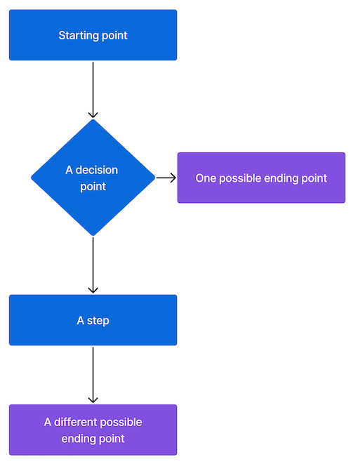
Flowchart: Flowcharts are useful for showing the steps in a process. In this example, the rectangles represent steps in a process and the diamond represents a decision point where the chart branches into two possible endpoints.
-
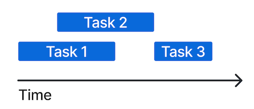
Gantt chart: Gantt charts are useful for showing how long tasks take and when they overlap. In this example, the horizontal axis is labelled "Time" and the blue rectangles represent three discrete tasks. Task 1 and task 2 overlap, which means that at least part of the tasks happen at the same time. Task 3 does not overlap with the other tasks, which means that it happens after the first two are completed.
-
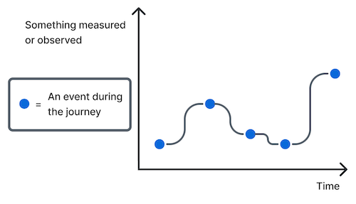
Journey map: Journey maps are useful for showing how the state of something over time. In this example, the horizontal axis is labelled "Time" and the vertical axis is labelled "Something observed or measured." Blue dots mark measurements at specific times and they are connected with a line to illustrate the trend over time.
Diagrams that explain arrangement
If you are creating a diagram to explain what or where things are, consider one of these diagram types.
-
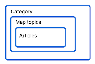
Block diagram: Block diagrams are useful for showing how things are organized by putting items within other items. This example shows how content is organized in GitHub Docs with the largest rectangle labelled "Category," a rectangle within that labelled "Map topics," and a rectangle within that labelled "Articles."
-
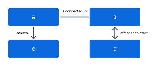
Concept map: Concept maps are useful for showing relationships between things. Different lines with or without labels show how things are connected or affect each other. In this example, the four blue rectangles represent concepts and the lines between them show different relationships between them.
-
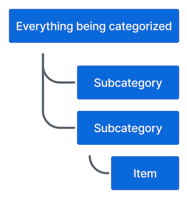
Hierarchy: Hierarchies are useful for showing relationships between categories and subcategories. In this example, three levels of a hierarchy are organized vertically.
Diagrams that explain context
If you are creating a diagram to explain why something is the way that it is, consider one of these diagram types.
-
Continuum diagram: Continuum diagrams are useful for showing where things fall on a linear spectrum. In this example, the blue rectangle shows that the item of interest is closer to Option 2 than Option 1 on the continuum.

-
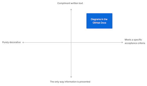
Quadrant diagram: Quadrant diagrams are useful for explaining the relationship between two axes and where things fall on both axes. In this example, the horizontal axis is labelled "Purely decorative" on the left and "Meets a specific acceptance criteria" on the right. The vertical axis is labelled "Compliment written text" on the top and "The only way information is presented" on the bottom. The blue square labelled "Diagrams in the GitHub Docs" is in the upper right quadrant formed by the overlap of "Compliment written text" and "Meets a specific acceptance criteria," which means that it has those two properties.
-
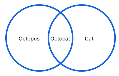
Venn diagram: Venn diagrams are useful for showing shared traits or overlap of ideas. Circles represent concepts or things, and the area where the circles overlap represent shared traits between things. In this example, the overlap between the circle labelled "Octopus" and the circle labelled "Cat" is labelled "Octocat," which is a combination of an octopus and a cat.
Style guidelines
Follow these rules to create diagrams that fit the style of GitHub Docs.
Shapes
Shapes represent objects or concepts in a diagram.
You can use elements from the GitHub UI such as octicons, menus, or buttons to create diagrams if they are relevant and legible.
For custom diagram shapes, use these shapes for their associated meanings.
- Rectangles: Things, objects, ideas.
- Stack of rectangles: Multiples of alike things.
- Diamonds: Decisions someone makes while following the diagram's flow.
- Circles, stars, or other shapes: Unique things that need to be different from anything represented by a rectangle.
The arrangement of shapes can convey meaning.
- Shape within another shape: This is part of that.
- Shape with an arrow pointing to another shape: This leads to that.
- Shape indented under shape: This is a type of that.
- Shape with a line to another shape: This relates to that. The thickness of the line can convey further meaning with thick lines indicating a strong connection and dotted lines a tenuous connection.
- Shape overlapping another shape: This is the same as that.
Lines
Lines represent relationships between shapes in a diagram.
Use different types of lines to convey additional meaning of relationships.
- Non-directional lines: Associations

- One-way lines that end with an arrow: Show sequences or point to objects.

- Two-way lines that have an arrow on each side: Indicate reciprocation.

- Brackets: Establish hierarchy. In general, organize brackets vertically so that they are easier to navigate on a webpage. Indent each level of a hierarchy.

Labels
Labels are visual and verbal markers. Labels should be 25 characters or less. To increase the contrast of a label, put the text in a rectangle. It is often easier to label things toward the end of creating a diagram.
Keys
Keys help with understanding by explaining what different elements of a graph are or explicitly clarifying relationships. Not every diagram will need a key.
Keys cannot introduce new information that isn't otherwise in the diagram. Keys cannot fix overly complicated diagrams. Keys should not define poorly labelled objects or relationships.
Keys should be used to explain shapes, colors, or other visual elements. Keys can also include citations or explanations of scale and manipulation. Keys can include some instruction like where to begin in a flow chart, but most instruction should be in the text that introduces a diagram.
Colors
If a diagram needs color, use colors defined in the Primer Design System. To make diagrams accessible to more people, color cannot be the only way to convey information. For example, if you use color to indicate a relationship, you must also use a line or other visual element to convey the same information.
The preferred colors for diagrams in GitHub Docs are:
| Color | Hex code |
|---|---|
| Black | #24292f |
| Blue | #0969DA |
| Gray | #57606a |
| Green | #1a7f37 |
| Purple | #8250df |
| Red | #cf222e |
Technical specifications
- PNG file format
- Static images only (no GIFs)
- File size of 250 KB or less
- Descriptive file names, such as
merge-conflict-diagram.pnginstead ofdiagram-02.png
If you need to create a diagram that is difficult to view at small resolutions, include a link to a larger version of the diagram in a relevant repository or other appropriate location. See "About Actions Runner Controller" for an example.
Tools for creating diagrams
The recommended tool for using diagrams is Figma so that you have access to Primer colors and other assets. However, you can use another program if you prefer. Follow the shape conventions in the style guide above and use the colors defined in the Primer Design System.
Accessibility
Diagrams must have proper contrast and alt text.
If you use colors defined in the Primer Design System, your diagram should have proper contrast. To check contrast on other background colors, use the Color Contrast Analyzer.
Write alt text for a diagram that describes what the diagram looks like and why it is included in the article. Do not try to explain everything the diagram conveys in the alt text since it could become too long to be useful. For more information on writing alt text, see "Style guide."
All information in diagrams must be also conveyed in text accompanying the diagrams.
Versioning
Some diagrams apply to all GitHub plans (GitHub Free, GitHub Pro, GitHub Team, GitHub Enterprise Cloud, and GitHub Enterprise Server). In this case, there is no versioning required.
When a diagram is only relevant to some plans or versions of GitHub Enterprise Server, the diagram must be versioned with Liquid conditional statements. You may need to add this versioning when the content is initially created, or you may need to add it when the content is updated for a feature update or GitHub Enterprise Server release.
If a diagram is only relevant to some versions and apt to become quickly out of date, consider if an easier to maintain option might be better for communicating the necessary information.
Source control
Diagrams are stored in the relevant directory in the assets/images/help/ directory in the docs repository. If you are creating a new diagram, add it to the proper folder. If you are updating an existing diagram, replace the existing diagram with the updated version.
When you create a new diagram, add it to the Diagrams project in the Docs Figma team or provide a copy of the Figma file to a member of the Docs team. If you create a diagram in another program, it can be included in GitHub Docs if it meets the requirements and recommendations in this guide, but it is much more likely to be removed rather than updated if it becomes out of date.
Examples
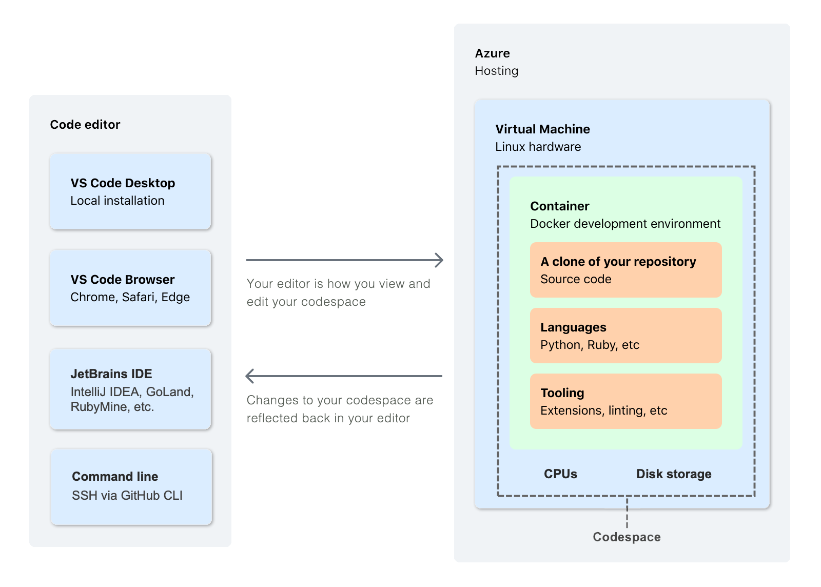
This diagram from "GitHub Codespaces overview" effectively uses rectangles within other rectangles to visually explain what parts of a codespace are contained in the cloud, and it uses arrows to show the relationship between a codespace hosted in the cloud and your local editor.
